|
Object Properties Dialog Box
This dialog box allows you to customize an object (marker or icon) and change its properties.
| Size Tab |

|
- Specifies the width of the object.
- Specifies the height of the object.
- Keeps the original height and width proportion.
- Specifies the rotation angle of the object.
- Flips the object horizontally.
- Flips the object vertically.
- Specifies the edge that will snap to walls (only in floor plans).
- Displays a preview of the object with the changed properties applied.
|
| Samples Tab |

|
- Displays the available preset samples for the object, to help you get started.
- Displays a preview of the object with the changed properties applied.
|
| Styles Tab |

|
- Displays the available styles/models for the object.
- Displays a preview of the object with the changed properties applied.
|
| Colors Tab |
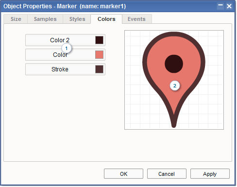
|
- This section lets you change the object colors.
Click a color button to open the Color Chooser dialog box, which allows you to change the selected color.
- Displays a preview of the object with the changed properties applied.
|
| Events Tab |

|
- Specifies whether the object element should receive mouse/touch events.
- Allows you to specify what to do when users move the mouse pointer over the object element:
- Tooltip: Display a tooltip box.
- Info Box (Text): Display a text-only info box.
- Info Box (Image): Display an image-only info box.
- Pop-up Box: Display a custom pop-up box.
- HTML Pop-up Box: Display an HTML pop-up box.
- Allows you to specify what to do when users click on the object element:
- Info Box (Text): Display a text-only info box.
- Info Box (Image): Display an image-only info box.
- Pop-up Box: Display a custom pop-up box.
- HTML Pop-up Box: Display an HTML pop-up box.
- Link: Open a URL.
- JavaScript Function: Call a JavaScript function.
- Pan & Zoom: Pan and change the zoom factor.
|
|